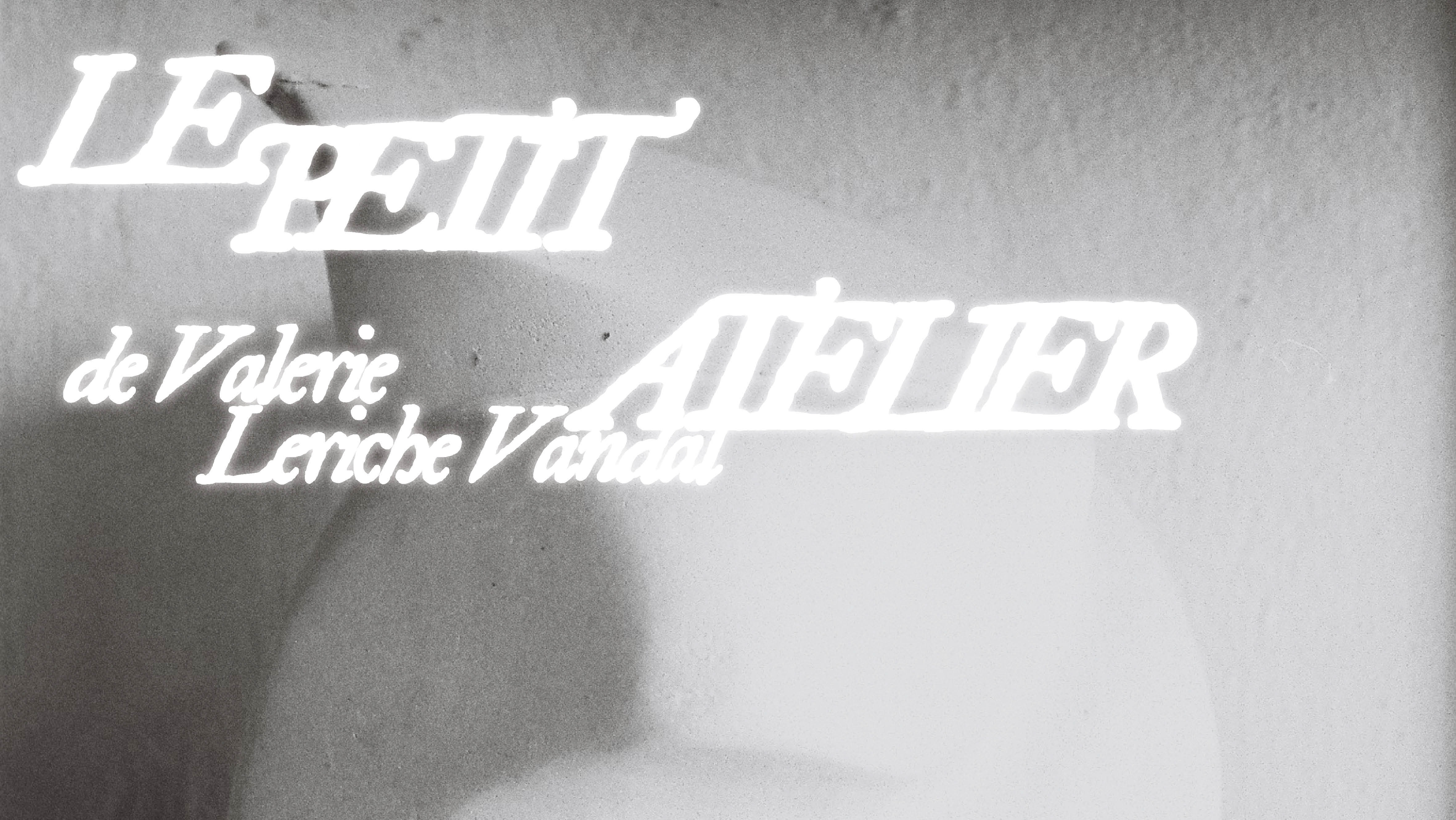
The idiosyncratic (ELAURINE) is a high-contrast display typeface with caracteristical serifs ● Its formal qualities, both sharp and elegant, are anchored in Sprat, Font. The exquisite bodies are the product of a typographic discovery process ● The aim of this course with no other than →Lisa Fischbach was to design a typeface, but also to see the world of letters through a different perspective. This helped me a lot to grasp the principles of typography and to gain a deeper insight into type design.

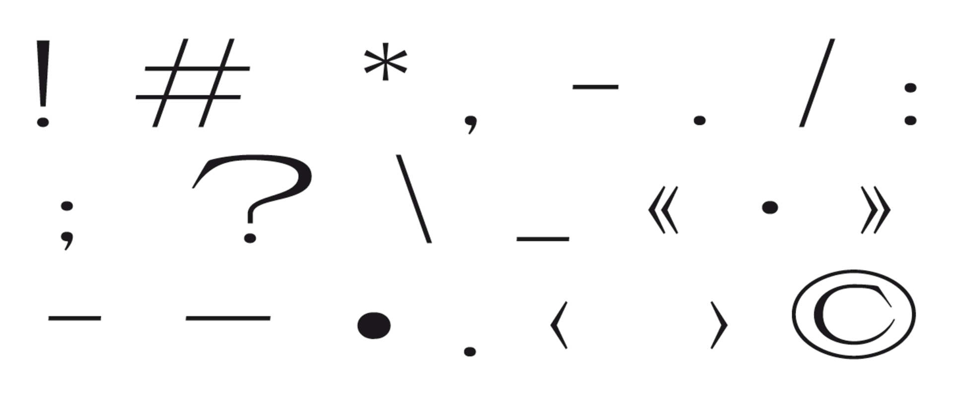
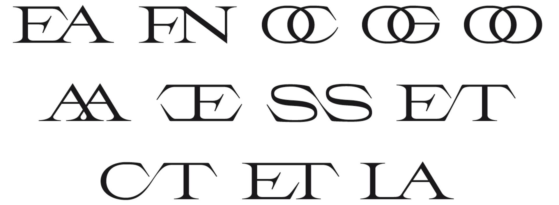
(Diacritics) were very important in the development of Elaurine, because one one requirement was to support French and English. In addition, the punctuation punctuation marks also play a big role. (Ligatures) The font should have interesting ligatures. This also led me to the Idea to draw Interlocking Serifs
👇